How to Get Photo Prints That Actually Match Your Screen
Trust me, just like you, I’ve had my share of bad prints, especially when I was first starting photography. The color would come out all wrong, the tone wouldn’t match what I saw on screen, and the whole thing was frustrating and miserable. So let’s demystify this a little, because it’s not as hard as it seems.
It comes down to understanding how your computer communicates with your printer and knowing the right settings, so that by the time you press print, you know you’re getting the best possible image—and one that matches your screen.
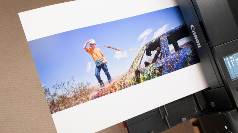
The Core Problem
We have one main goal here: getting the print to look like what you see on your monitor. The reason this is tricky comes down to gamut—the range of colors any given device can reproduce, whether that’s a monitor or a printer. There’s a lot of overlap between the two, but there are inherent differences. A monitor is additive; it projects light from behind the screen into your eyes, so you’re always getting the most vibrant, bright colors. Printer ink is subtractive; it lays ink down on paper, and the result depends partly on the light you view it under.
This is where color management comes in. Color management doesn’t bridge the gap between monitor and paper; instead, it shows you on your monitor what to expect from the paper once you print.
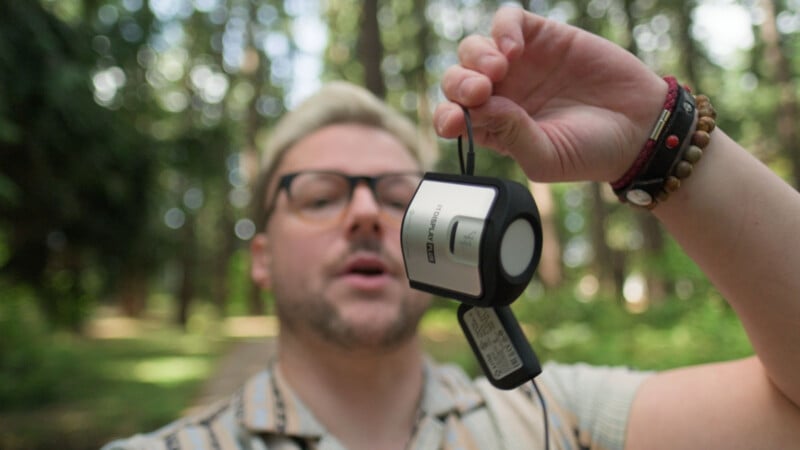
Regardless of how much we adjust our software, hardware also matters. A dedicated photo monitor and a good photo printer will outperform a gaming monitor and a basic inkjet. But tools exist to take the guesswork out and standardize things, such as a color calibrator, which will calibrate your monitor colors to a predetermined standard, getting you closer to seeing true print colors, even if you don’t have a fancy monitor.
My Workflow
I work in Capture One and my printer is the Canon PIXMA PRO-200, but this works across any software and printer. The menu items may live in different places, but the methodology is the same.
I’ve got Capture One open with the image I want to print—a photo from Joshua Tree earlier this year, captured on the Fujifilm GFX100RF. The first concept is the working color space. Most of the time that’s either Adobe RGB or sRGB, but because Capture One is raw processing software with its own larger color space, you don’t have to select the output space until you export.
At output, you choose the color space, listed as the ICC profile. Each device has its own ICC profile, and that’s how they communicate. If your profile is Adobe RGB, the output device knows it’s receiving Adobe RGB.
Soft Proofing
So why so many ICC profiles? That’s where soft proofing comes in. Soft proofing is how your software shows you an approximation of how the image will look on a given medium or device.
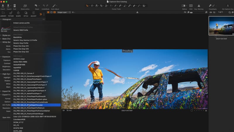
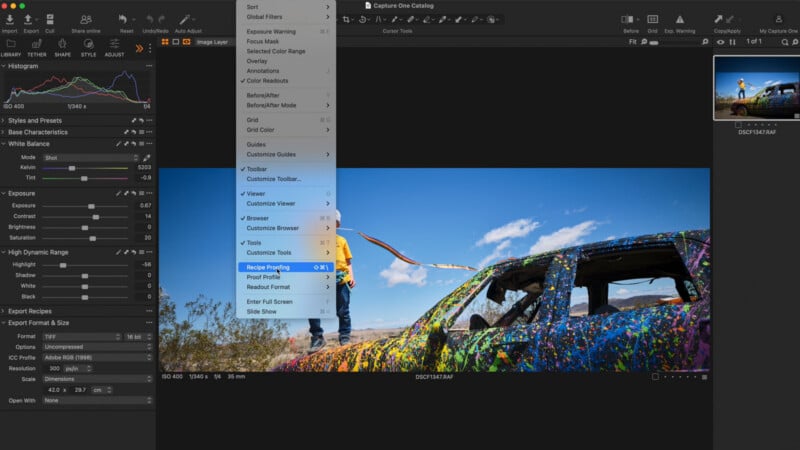
In Capture One, you turn it on under View, Recipe Proofing. It gives you a tag so you know you’re viewing through a different color profile, which keeps you from accidentally grading under a profile you don’t actually want to end up with.
From there, you can switch between profiles. I’ve pulled in several for the Canon PRO-200 based on different papers. Select Lustre, which is the paper I’ll be using, and the image shifts slightly. For a more extreme example, select something like Japanese washi paper and it looks noticeably more desaturated, and a little milky in the blacks and shadows. As long as your monitor is calibrated, it gives you a very good approximation of what you’ll see on paper.
When it’s Time to Print
Here’s the counterintuitive part. When you actually print, you do not embed these specific profiles. When you tell your printer what paper you’re using, either in the print dialog or on the printer itself, that’s what determines the look. Your main job at print time is to hand the printer the most accessible color profile available, which is usually Adobe RGB or sRGB.
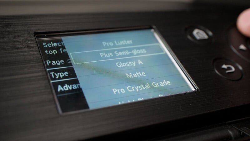
Now for the printer settings. The first thing when you power on is paper size and paper type. On some printers you set this in software; on this one I set it on the device. It’s critical when the printer is managing color, because that means you do no color management on the software side; the printer already knows the paper and handles the conversion.
Even if the printer isn’t managing color, setting this still matters. It knows the size, so it knows how much ink to lay down, which is especially important for borderless prints so ink isn’t spilling over. Paper type also matters because each paper type needs different amounts of ink—some are more porous and need more, some less, and they require different heat to adhere the ink. So wherever you’re managing color, always set this to match the paper you’re using.
The Print Dialog Settings
Now onto the print dialog, where the main settings live. For the color profile you have two options: let the printer manage it, or let the software manage it. You do one or the other, never both. If you choose software management and pick Adobe RGB like we discussed, make sure the printer isn’t applying a second profile on its end. You’ll even get a warning to turn off color management in the print dialog.
On Mac this is simple; it doesn’t give you the option to double up, because it knows the software is managing color and tells the printer accordingly. You can still check the printer’s own menu to confirm it isn’t converting, but the software is usually smart about it. Windows, which is my main workstation, is a different story. It gives you far more options to manage color from the printer, which also makes it far easier to accidentally have both software and printer managing at once. So keep it to one or the other.
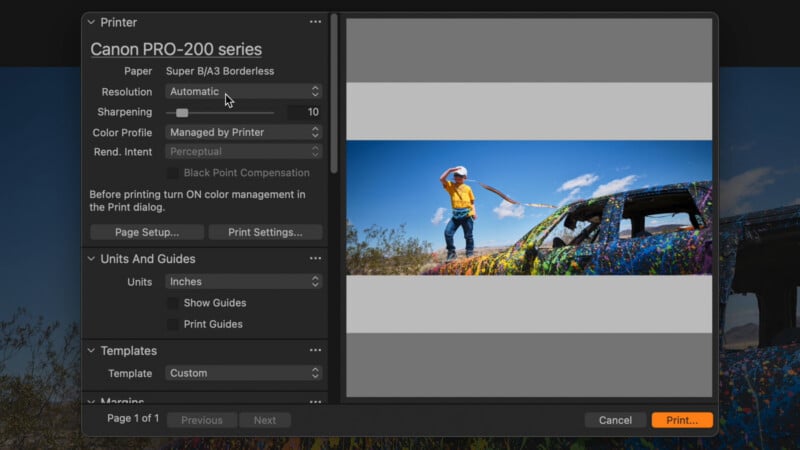
For resolution, all you really need is 300dpi. Going higher to 600 or 1200 prints microscopic detail the human eye won’t catch on a framed or hung photo. Sharpening is interesting because it happens separately from any sharpening in your software. At zero you’ll still get good detail, but it reads a touch blurrier and hazier than the screen version. I recommend keeping it low, but try and experiment.
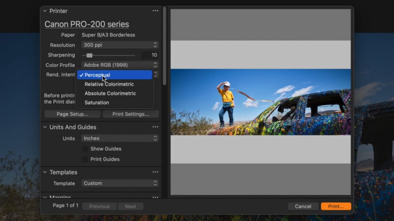
Rendering intent has four options, which I’ll outline briefly here. Perceptual takes all the colors and uniformly condenses them into what the printer ink can reproduce, which is a bit like applying a contrast adjustment across the whole image. Relative colorimetric keeps the colors inside the printable space the same and truncates the ones it can’t reproduce, so you get accurate tones but possibly more crunch in the highs or lows. Absolute colorimetric works similarly, but instead of adjusting the white point to what white looks like on the paper, it holds the white balance as is, so whites reading slightly yellow or blue keep that information rather than being balanced to an absolute white. Saturation prioritizes bright, vivid colors over accurate skin tones. Most of the time I use perceptual, since it holds the colors closest to what you see on screen.
Jumping into the print settings themselves, you’ll notice there aren’t many options, so there’s little room to accidentally have the printer double-manage what the software already set. For quality, I leave it on normal. There’s also best, but it uses a lot more ink and the image quality doesn’t change perceptibly, so normal saves money on expensive ink. That’s really all the settings you need beyond sizing and paper.
That about does it. Whether you’re printing at home or sending it out, lock in your settings and color profiles and you’ll know you’re getting the image you see on your own screen.
Affiliate Disclosure PetaPixel articles may include affiliate links; we may earn a commission if you buy through one.